Chris Foss: Architect of Alien Worlds
If you’ve ever stared at a vintage sci-fi paperback and thought, “Why does this spaceship look like a flying oil refinery dipped in Skittles?” — chances are, you’ve seen the work of Chris Foss.
With no formal art school training and a background in architecture, Foss practically invented a new visual language for science fiction—one where machines felt monumental, alien, and somehow… joyful.
This article dives into the weird and wonderful legacy of Foss’s work—how he went from drawing battleships as a teenager to defining the aesthetic of science fiction’s golden age. Think airbrushed megaships, neon geometry, and landscapes ripped from cosmic Westerns. We’ll explore how he got so prolific, what made his art feel so alive, and why his influence keeps showing up—from Alien to Guardians of the Galaxy.
-
Chris Foss designed hundreds of sci-fi book covers without reading the books. Bold move.
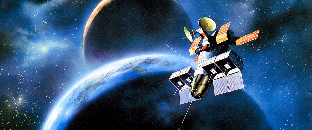
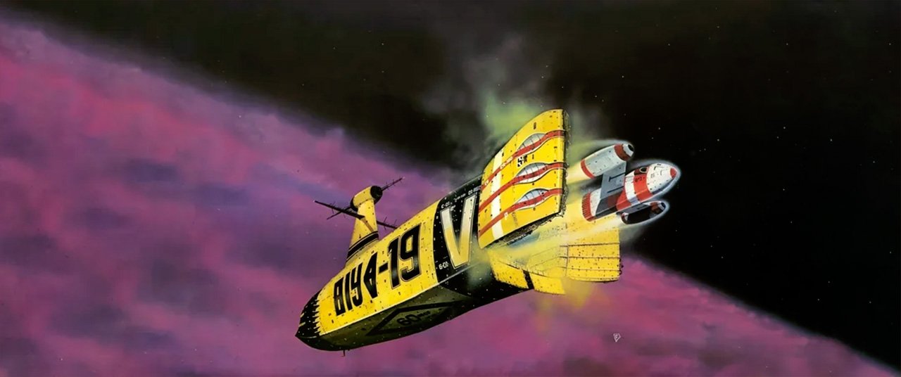
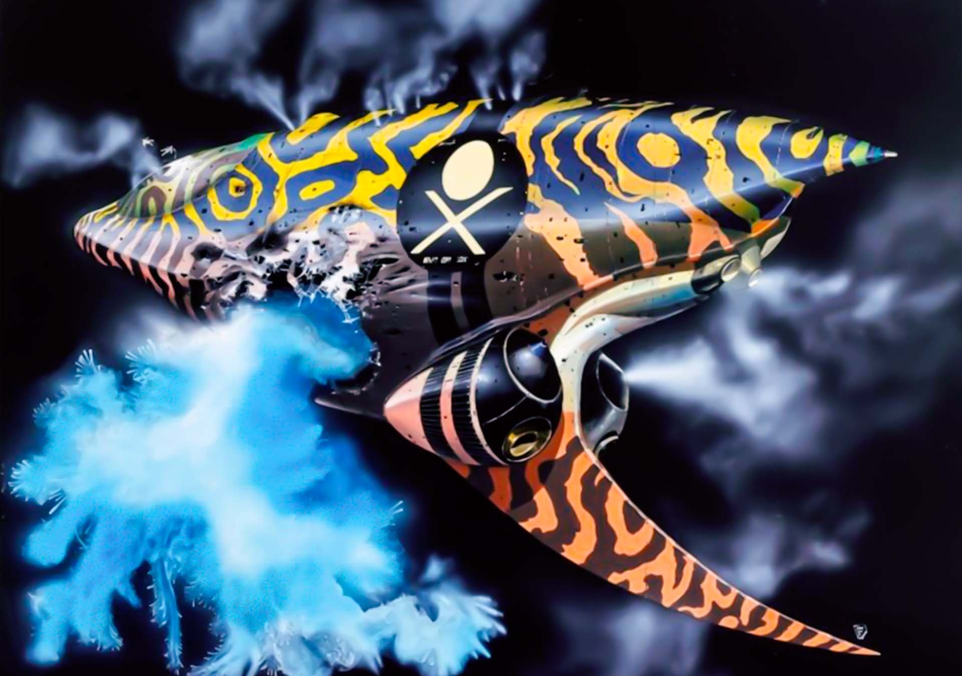
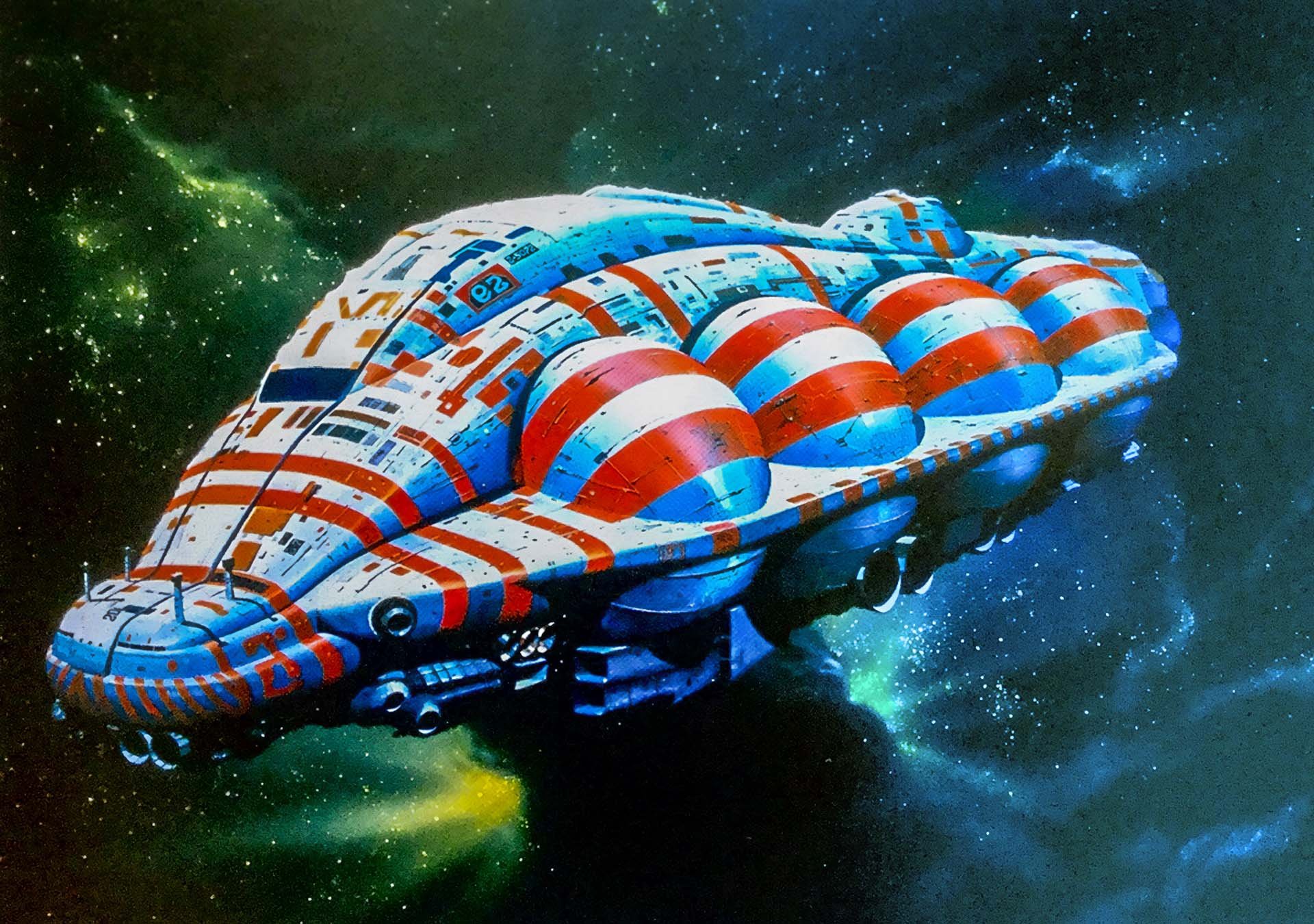
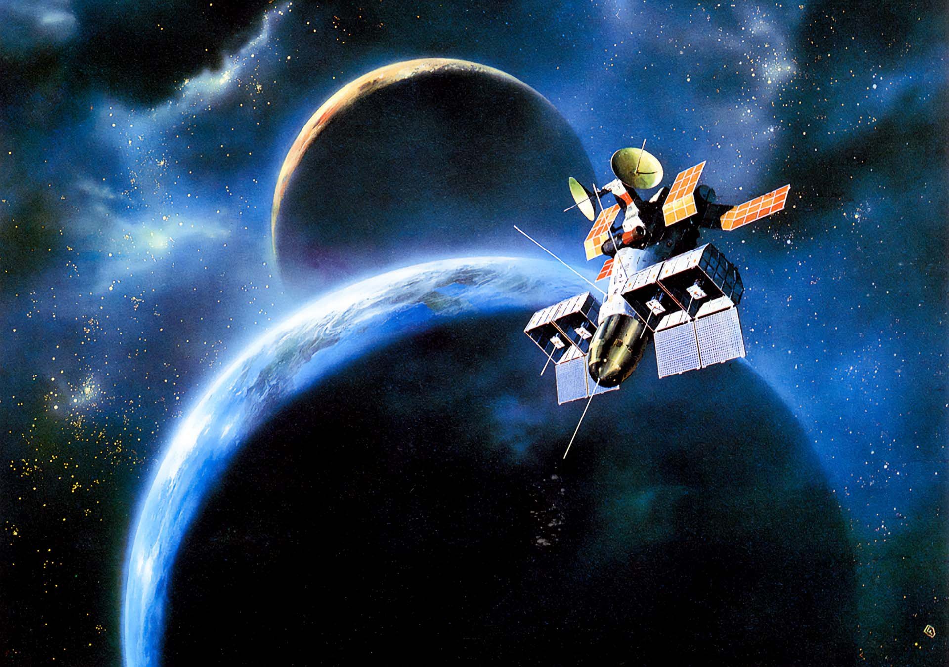
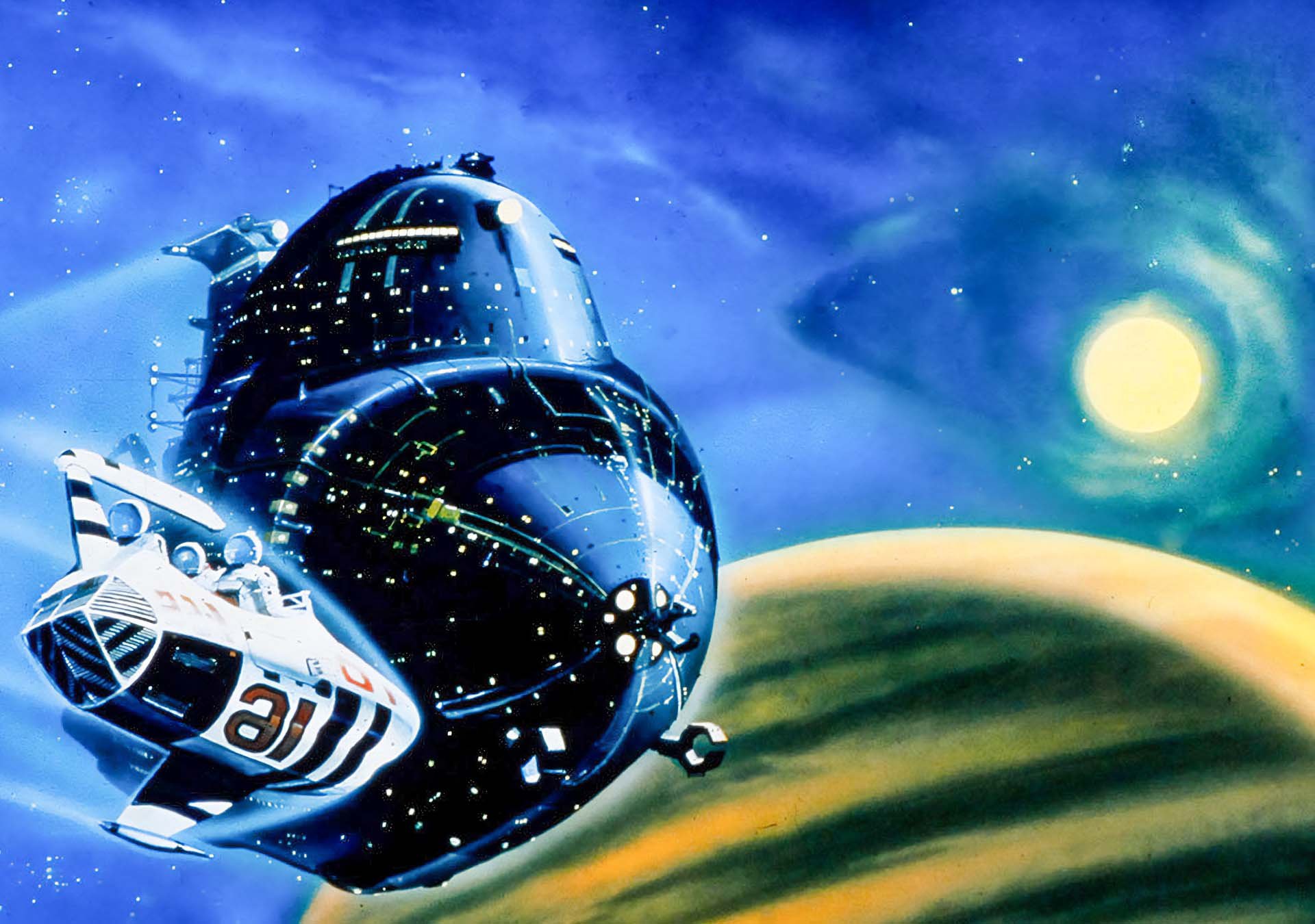
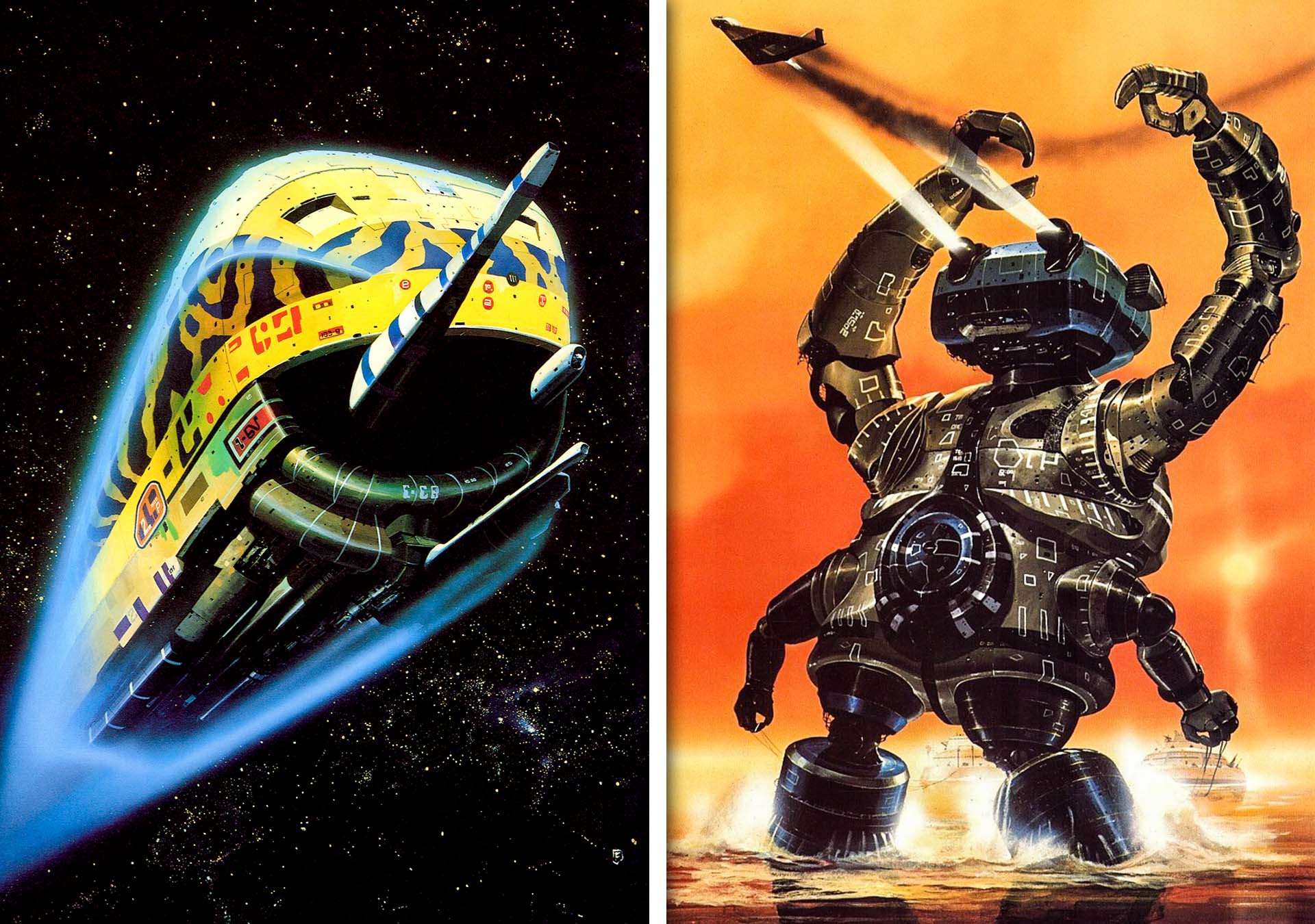
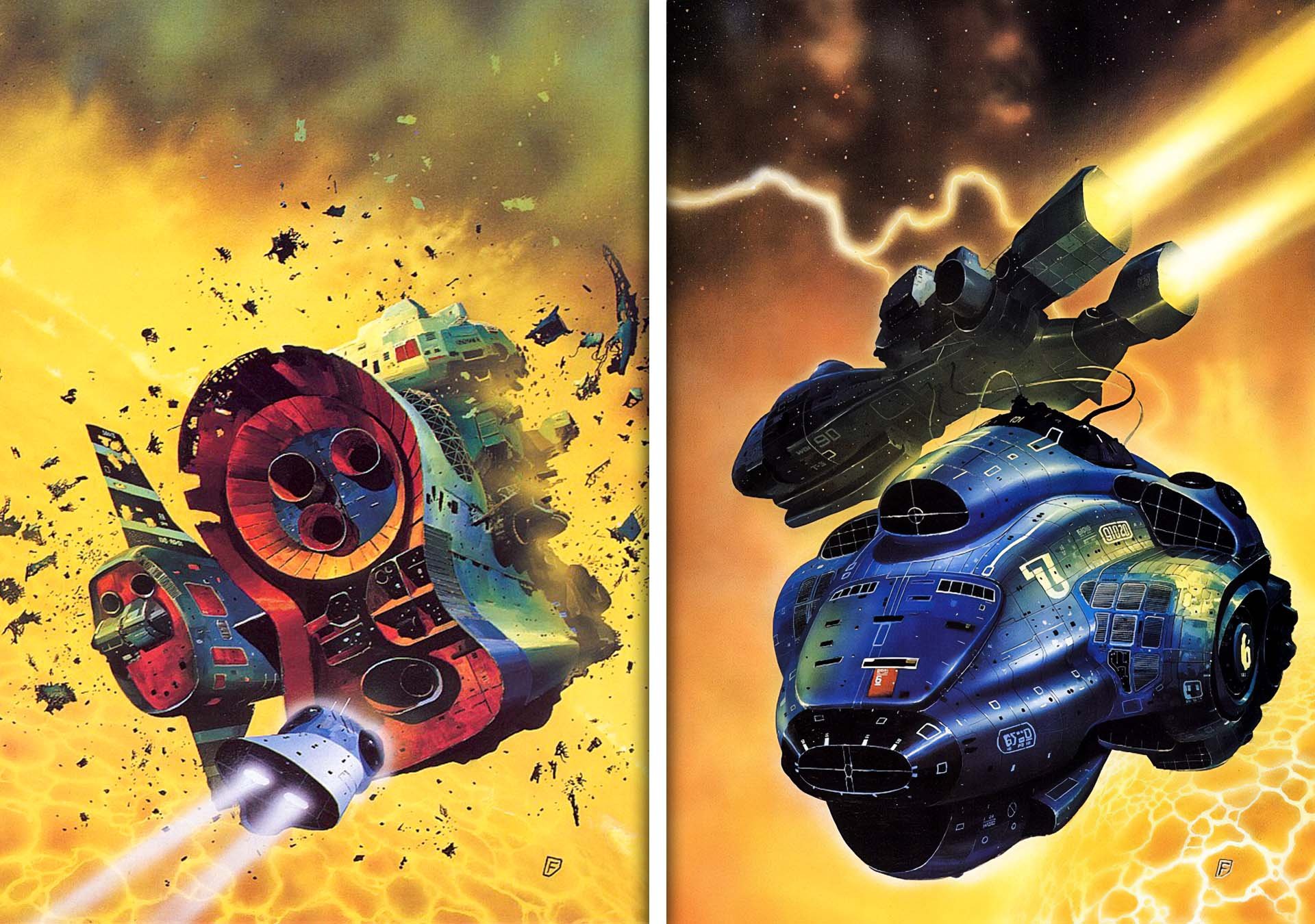
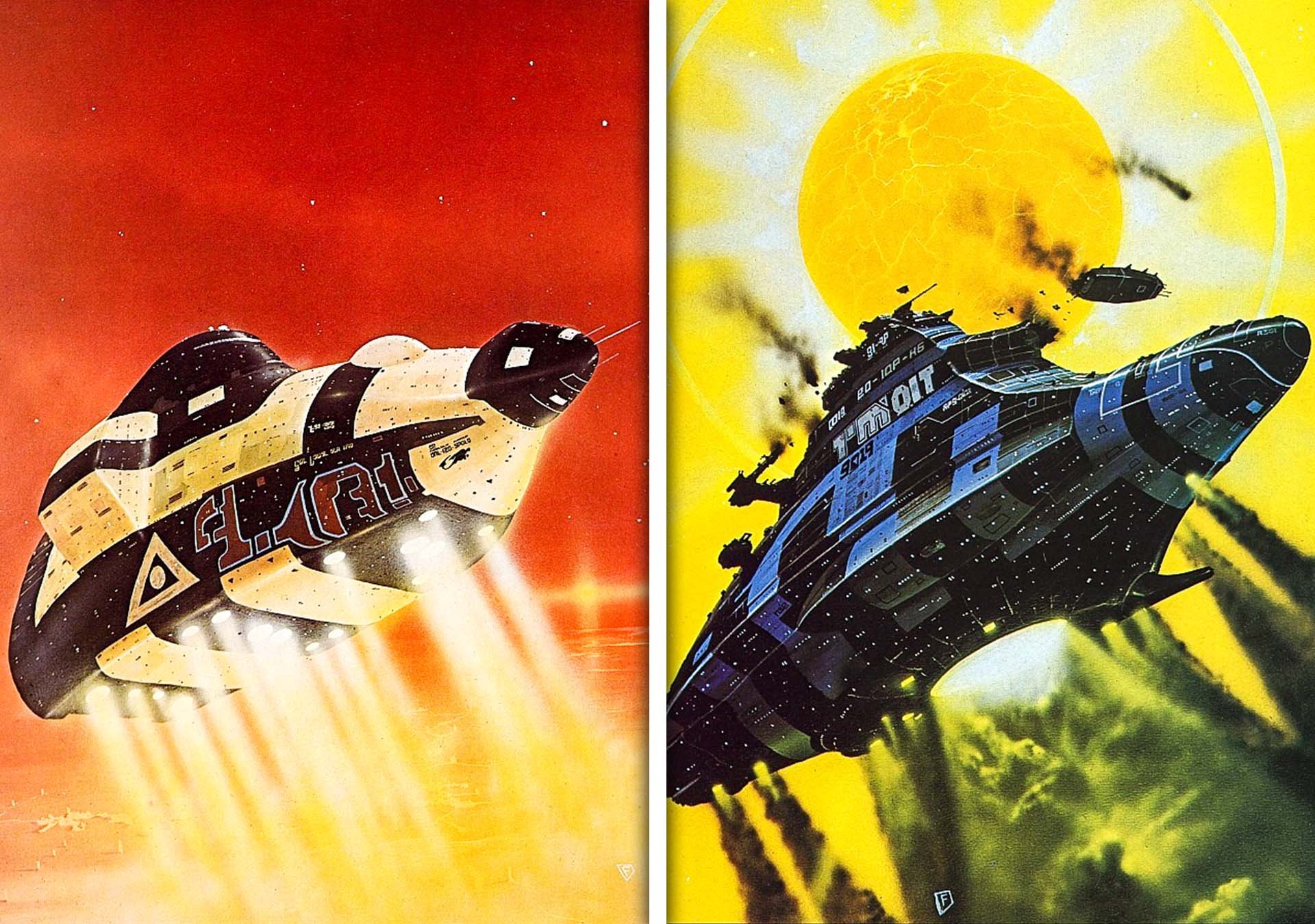
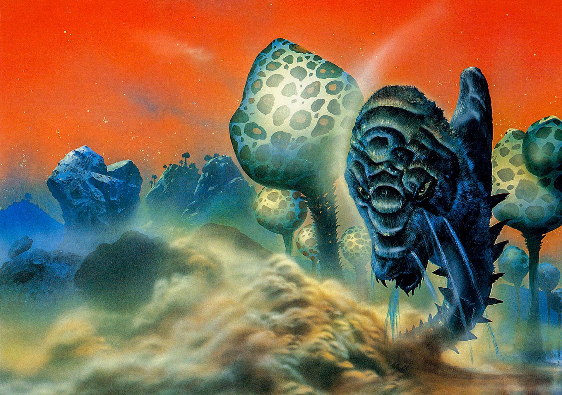
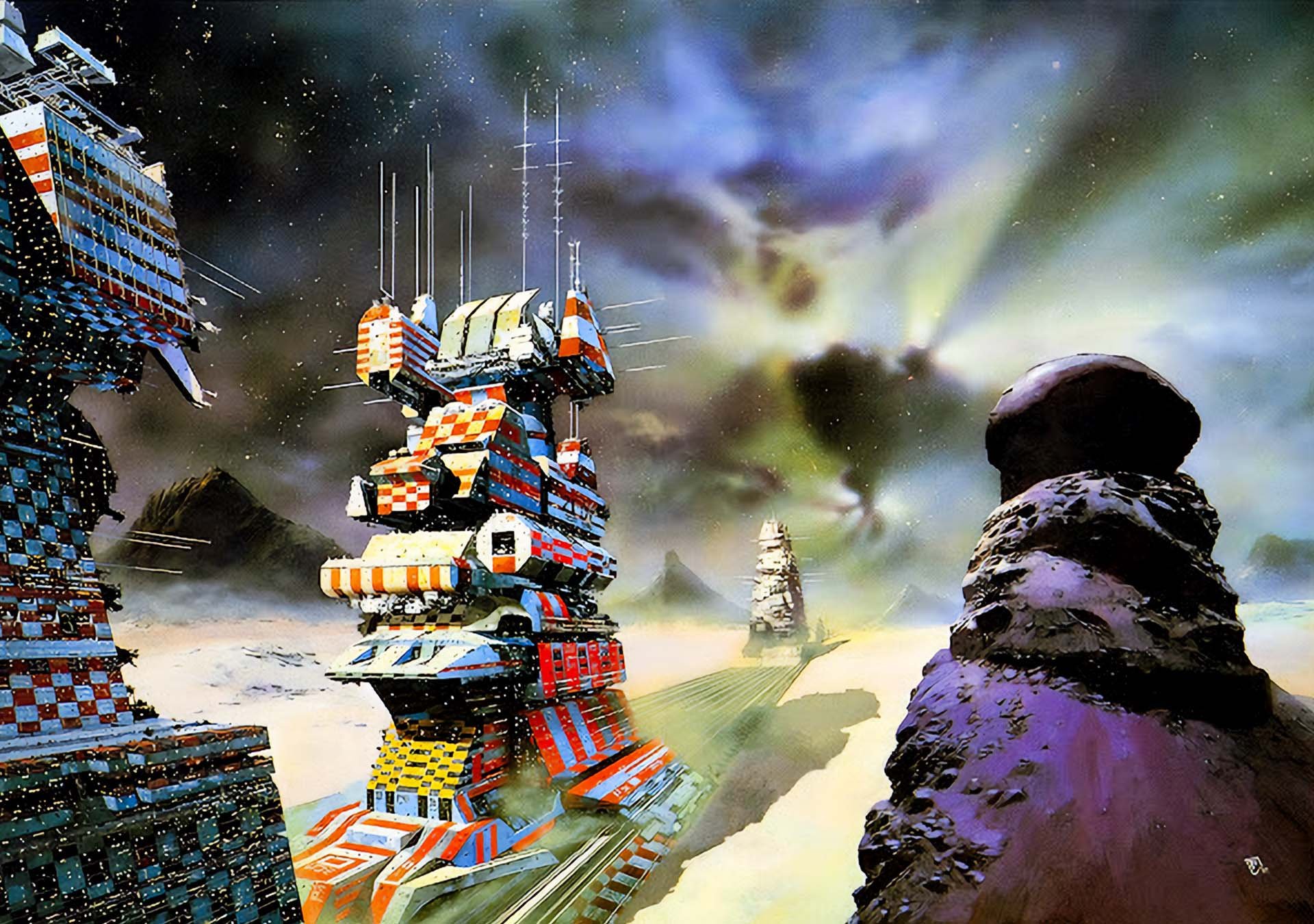
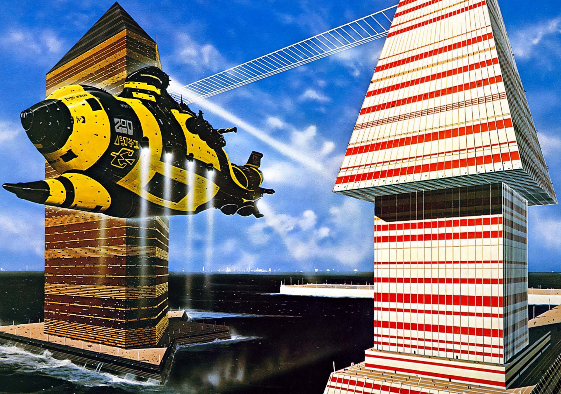
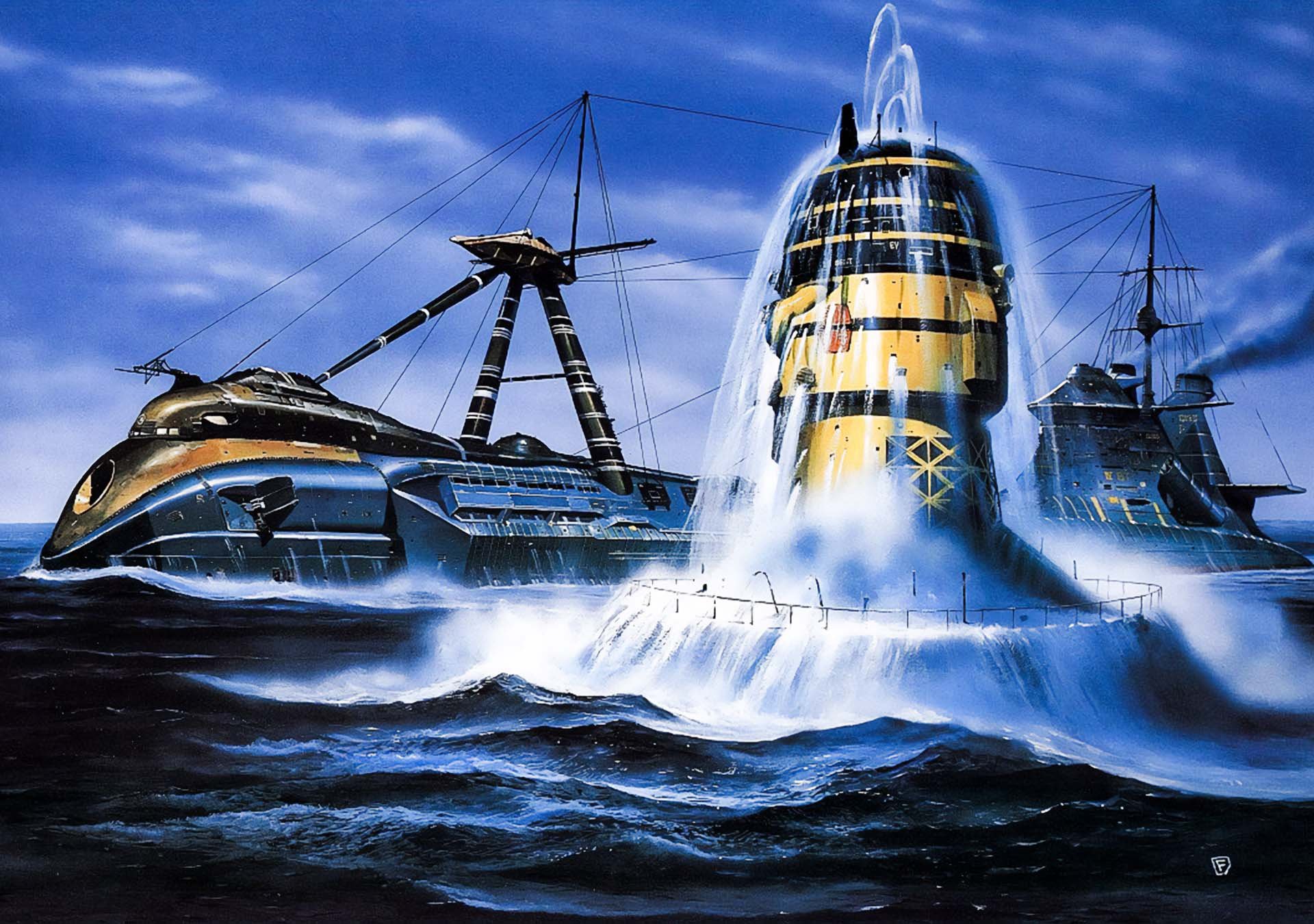
His spaceships look like psychedelic submarines built by a race of architects from Mars.
Foss trained as an architect at Cambridge—explains why everything looks engineered to actually exist.
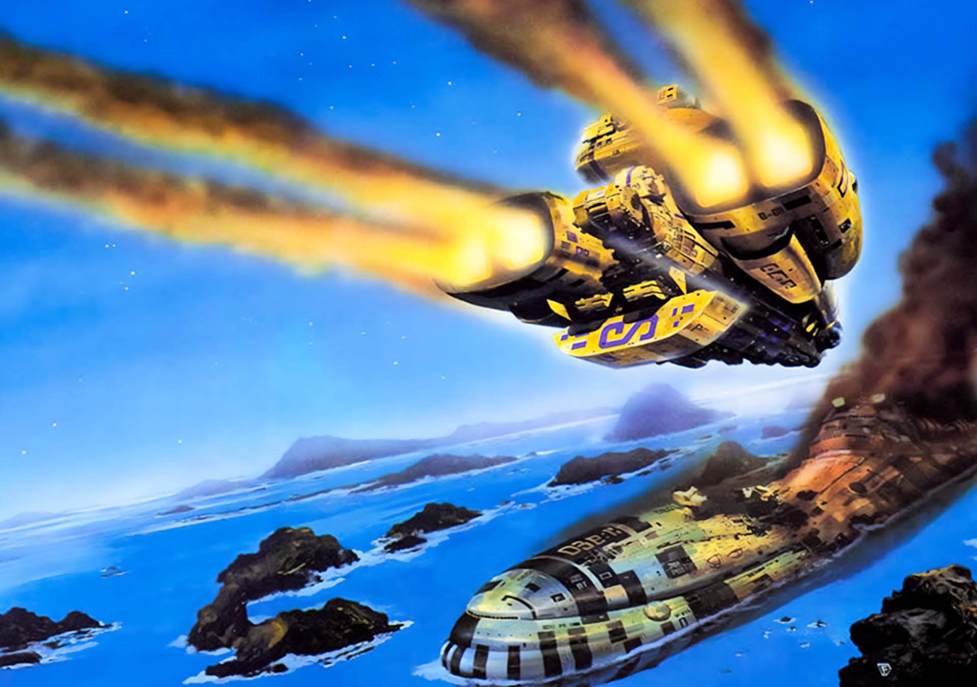
He drew inspiration from Westerns and war photography, giving his ships dramatic scale and story.
Produced up to 3 book covers per week using a fast, intuitive airbrush technique.
Helped shape the visuals of Jodorowsky’s Dune, Alien, and Guardians of the Galaxy.
Nobody else made space look this bright, brutal, and bizarre.
“Spaceship, but Make It Epic”
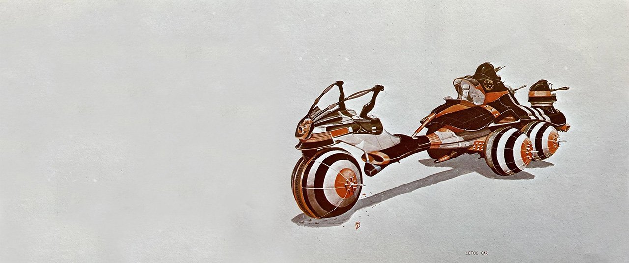
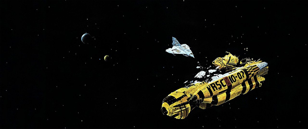
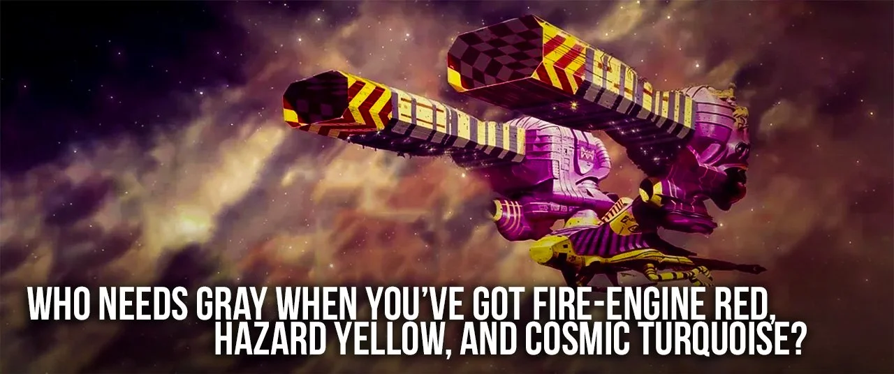
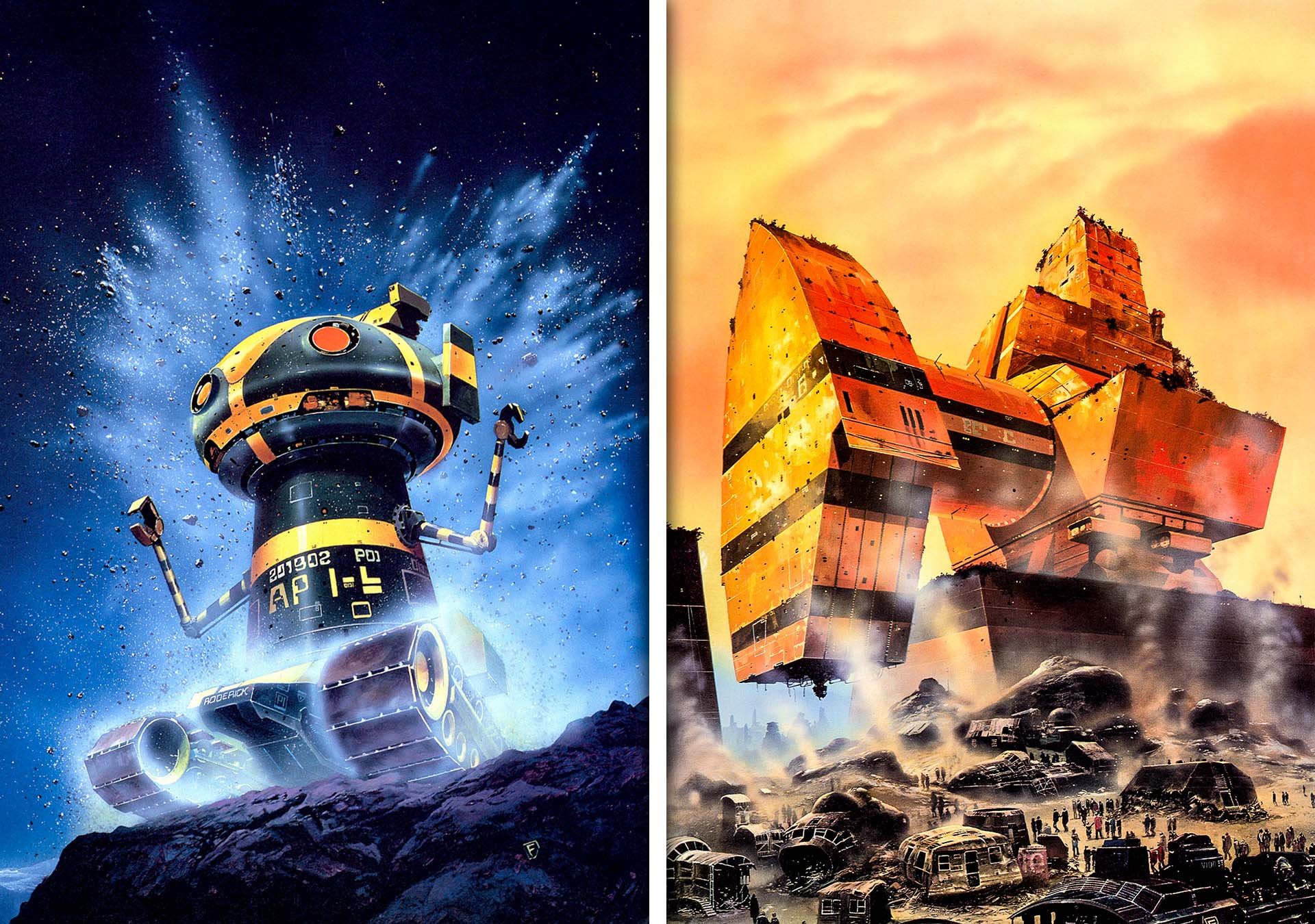
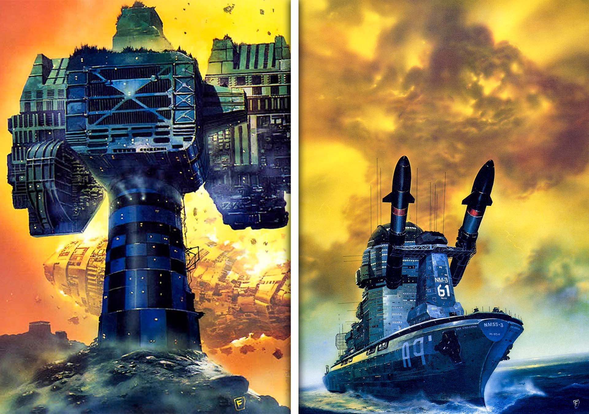
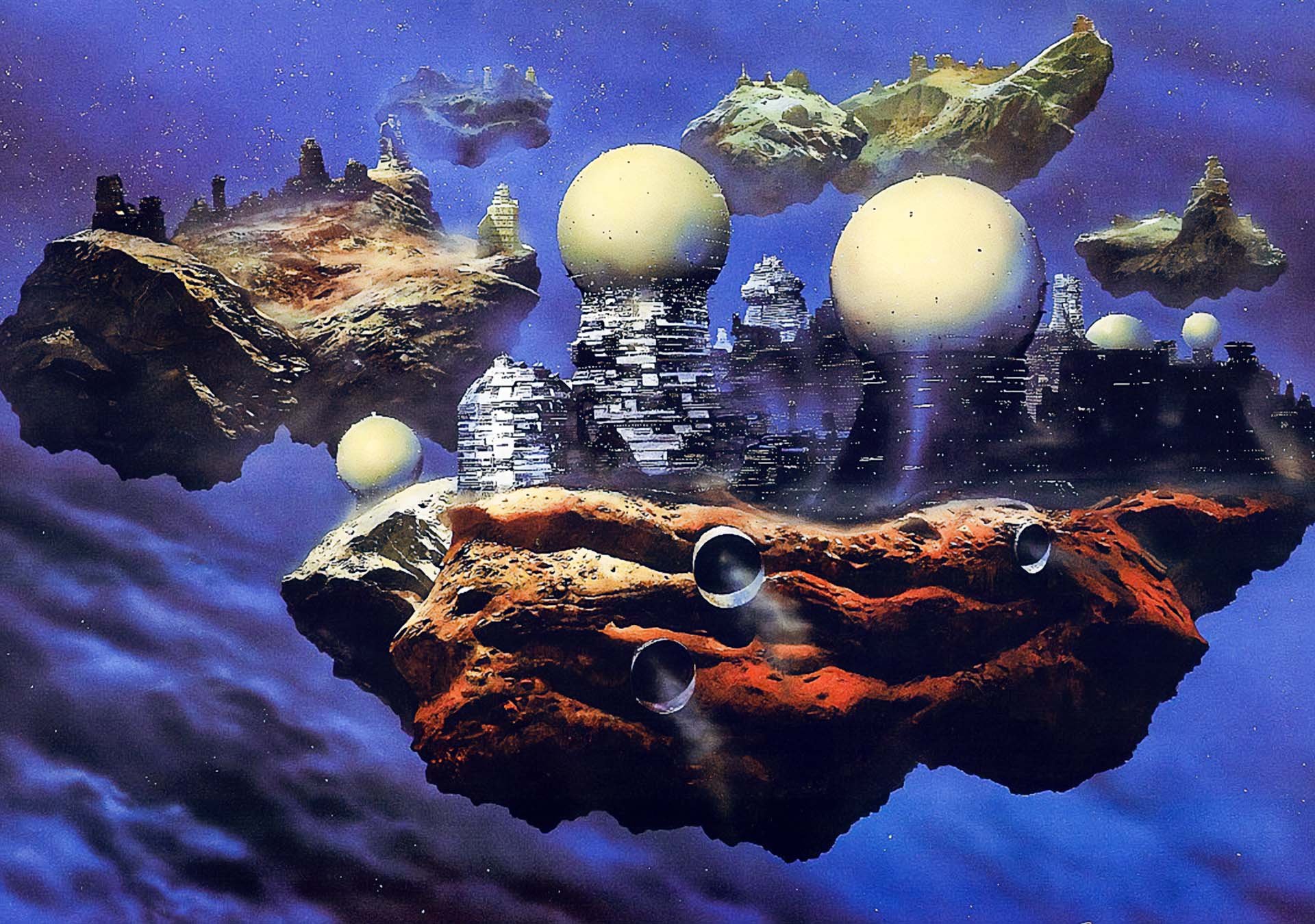
Let’s be real—most sci-fi ships are either “flying saucer” or “gray rectangle with attitude.” Nope. Let’s give it ten exhaust ports, a hundred yellow hazard stripes, and make it float like a tank-sized hummingbird.
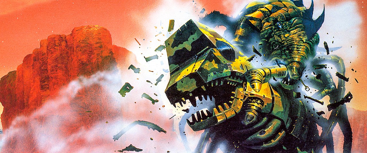
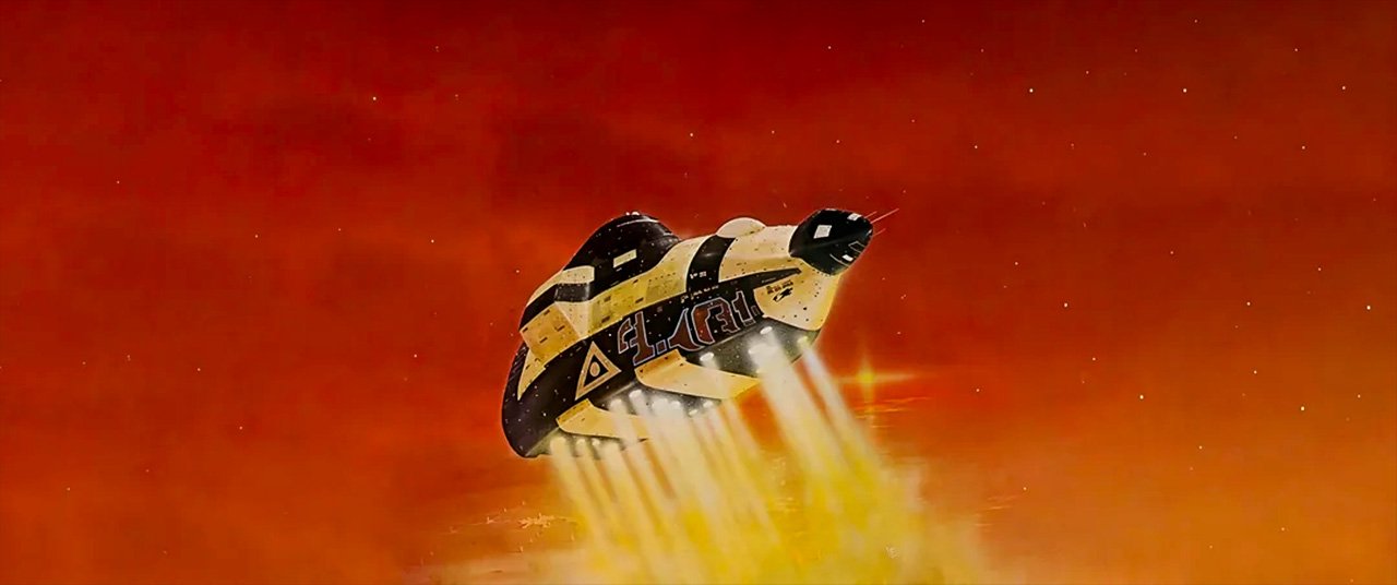
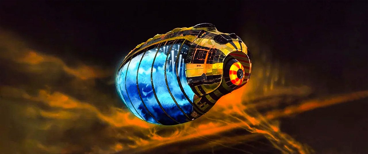
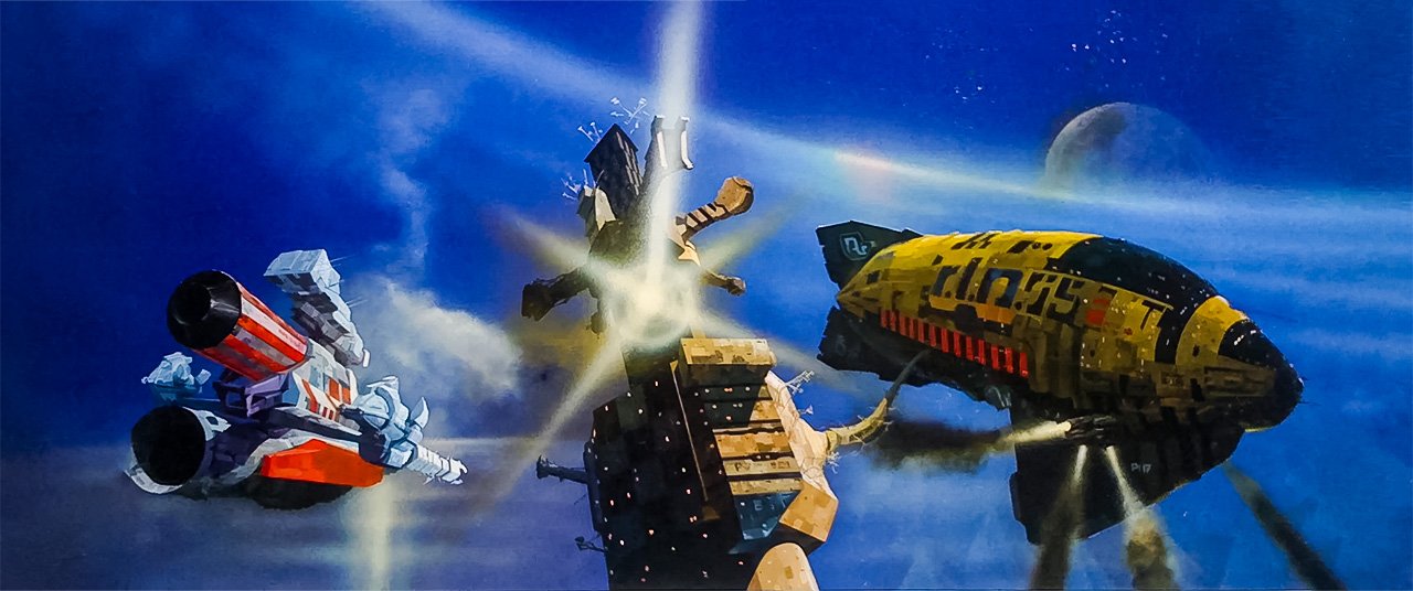
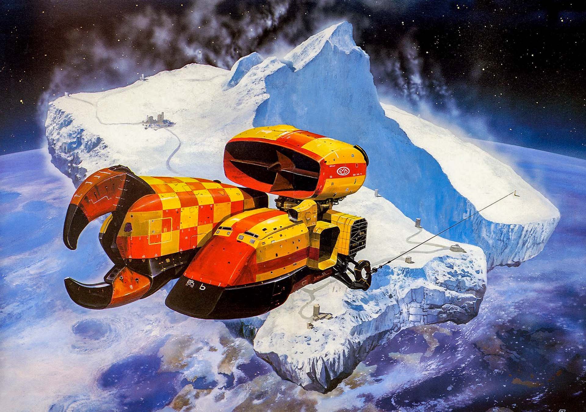
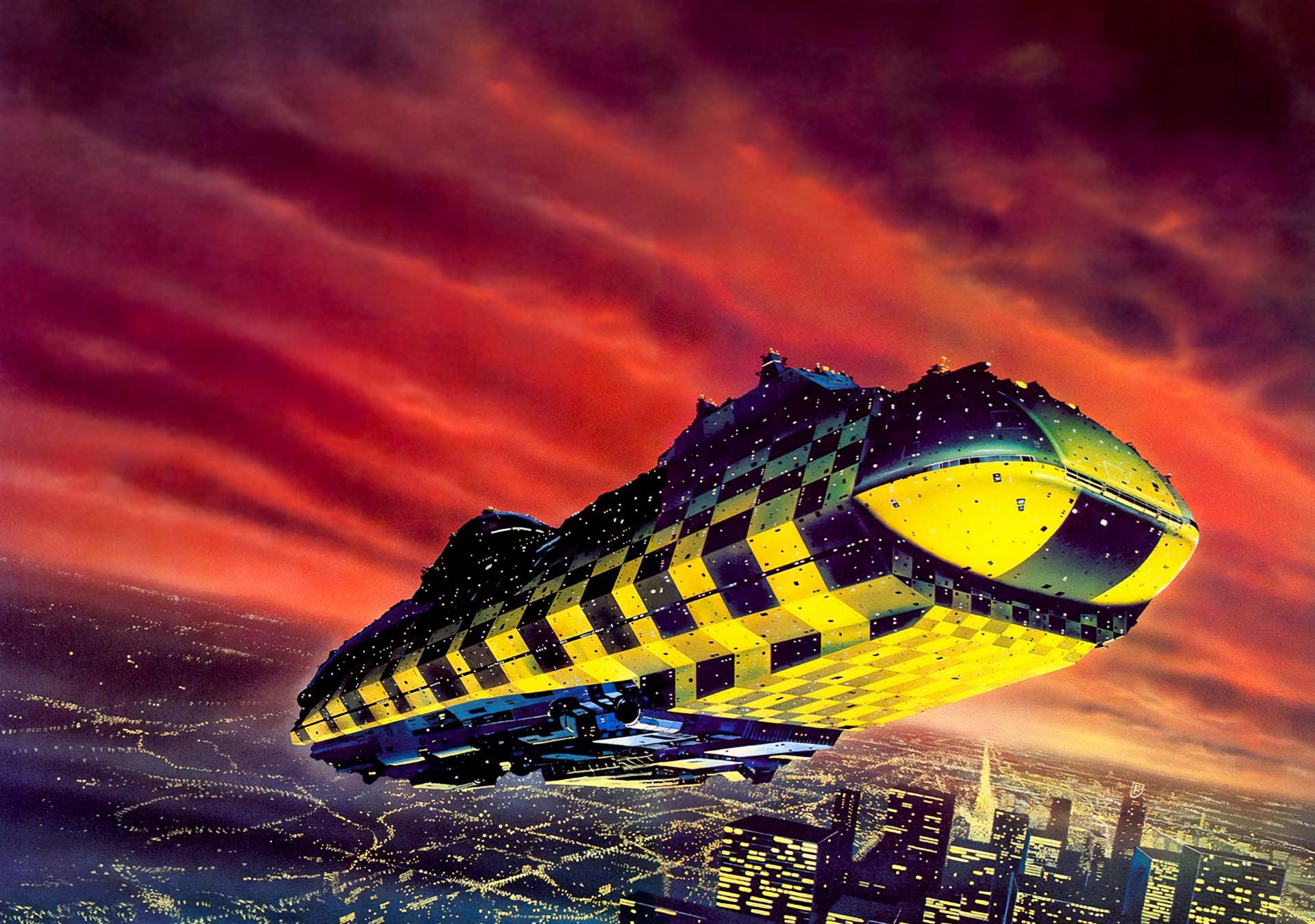
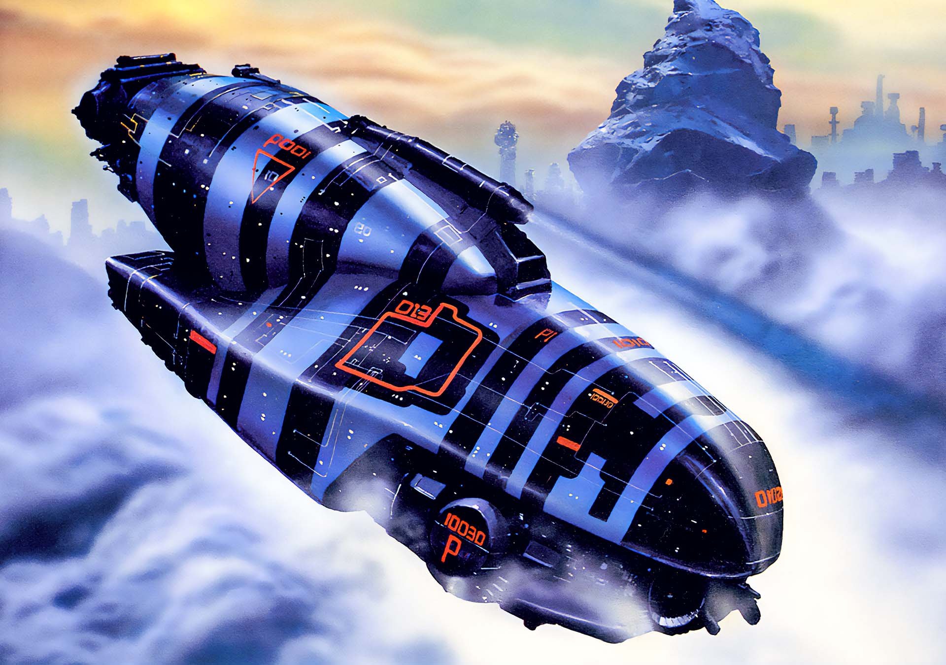
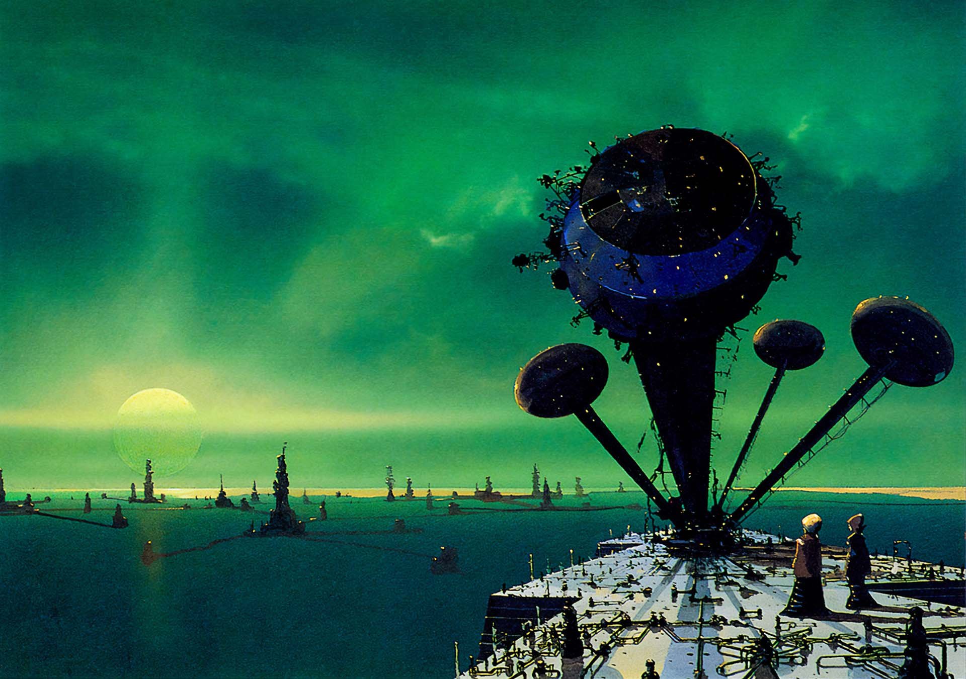
Foss’s ships feel monumental. Giant floating monoliths. Industrial alien cathedrals. They have rust. Panels. Guts. If Star Wars gave us “used future,” Foss gave us “used and loved future”—color-coded, detailed, and alive.
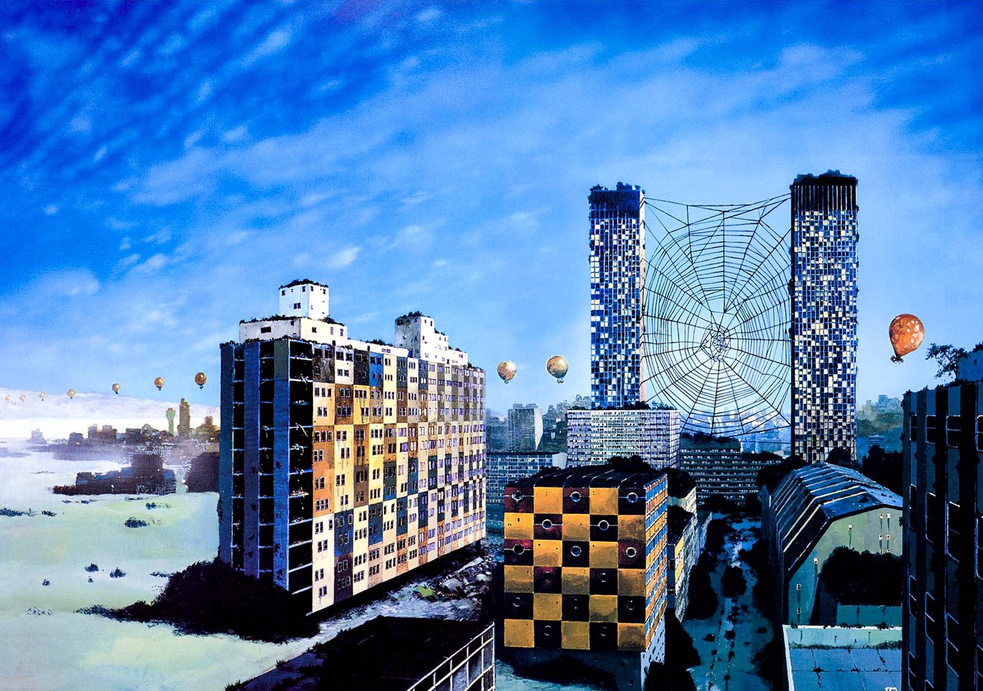
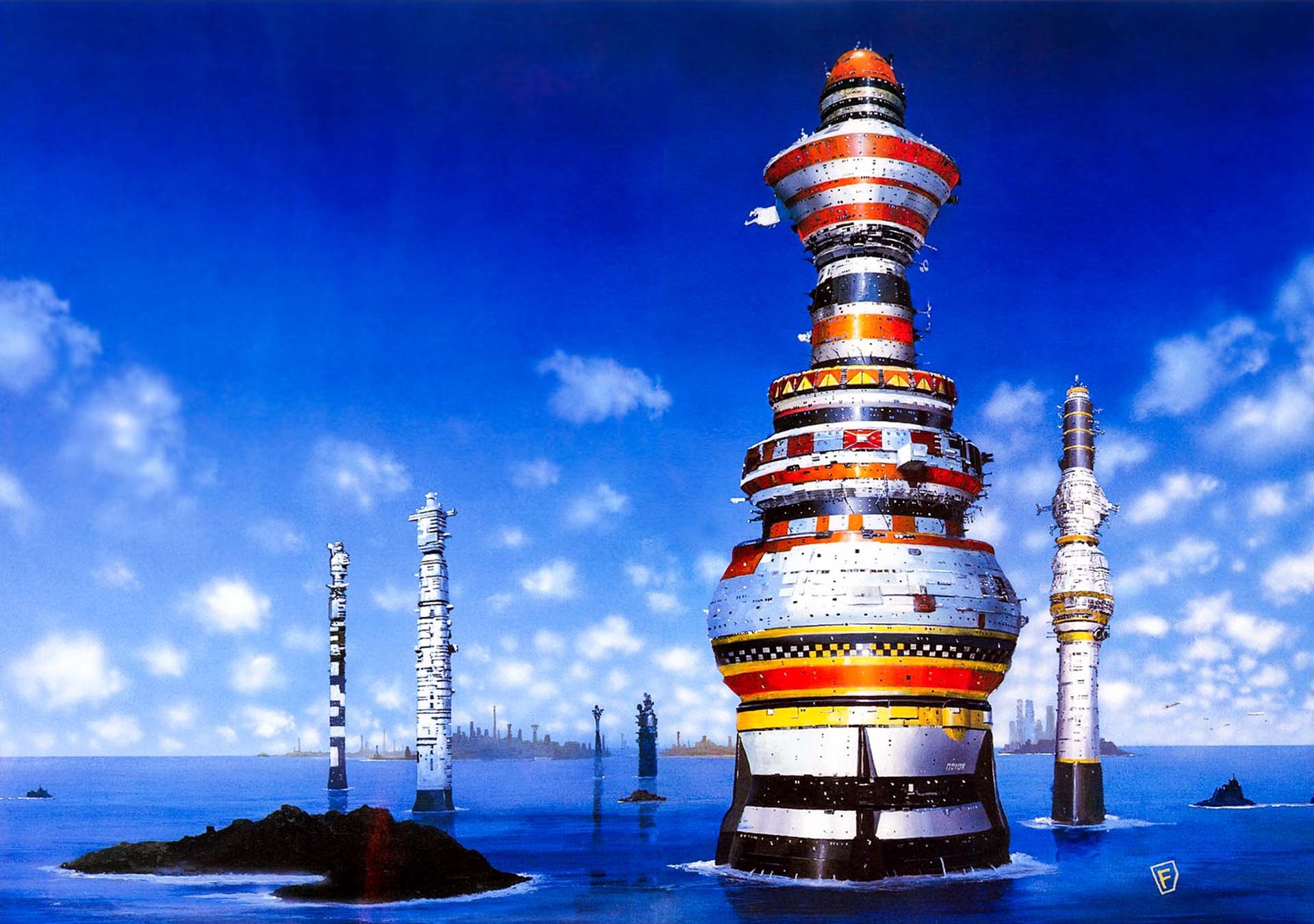
He Built Worlds Like an Architect
Foss never went to art school. He studied architecture at Cambridge. Which explains a lot. His structures look engineered, not imagined. There’s a logic to every pipe, every weird antenna, every bolt.
While other artists sketched “cool” ships, Foss was designing buildings that fly—full of tension, balance, and texture. Even his war machines have a kind of elegance, like alien temples built for battle.


Color Bombs in the Cold Void
Who decided space had to be gray? Nah. Let’s paint this planet orange and make the ship lime green.
The guy loved color. Bold. Primary. Unapologetic. His use of bright, clashing palettes gave his sci-fi worlds an emotional pulse—sometimes threatening, sometimes serene, always unexpected.
It was like staring at a nuclear reactor built by a kindergartener with godlike design instincts. And yes, that’s a compliment.
Cowboys, Combat, and Cosmic Dust Trails
Foss’s biggest influences? Spaghetti Westerns and war photography. Really.
He loved the emotional scale of cowboy epics: the lone figure, the sweeping dust trails, the sense of endless wilderness. He translated that into sci-fi by making his ships feel small against alien skies, or looming like battleships over tiny explorers.
The result? Every Foss painting feels like a moment in a bigger story. There’s tension. Movement. Danger. All without a single word.
Chris Foss didn’t just imagine alien worlds—he built them. Brutal. Beautiful. Weirdly fun.
Wait… He Didn’t Read the Books?
Nope. He just got the manuscript title and vibe—and ran with it.
Which is weirdly brilliant. Foss’s covers weren’t literal—they were interpretations of potential. His imagination wasn’t chained to the author’s. That’s why his visuals feel so untethered and otherworldly.
Plus, he was a machine: up to three covers a week at his peak, cranked out with airbrush speed and alien intuition.
Foss in Hollywood (Sort Of)
He was hired for Jodorowsky’s legendary failed Dune (you know, the one with Salvador Dalí, Pink Floyd, and no chance in hell), and later worked on Alien, Superman, and more.
His actual designs rarely made it to screen intact, but his style—colorful, massive, unpredictable—snuck into the DNA of modern sci-fi films.
Director James Gunn even tapped his style for Guardians of the Galaxy. Foss’s influence is still out there… hiding behind the nebula.
With bold color, impossible scale, and architectural precision, he made the future feel physical.
If his art makes you want to dust off your old paperbacks, blast some synth, and paint your microwave bright orange—well, that’s the Foss Effect. ∞